
Hope United Survivor Network Case Study
Challenge
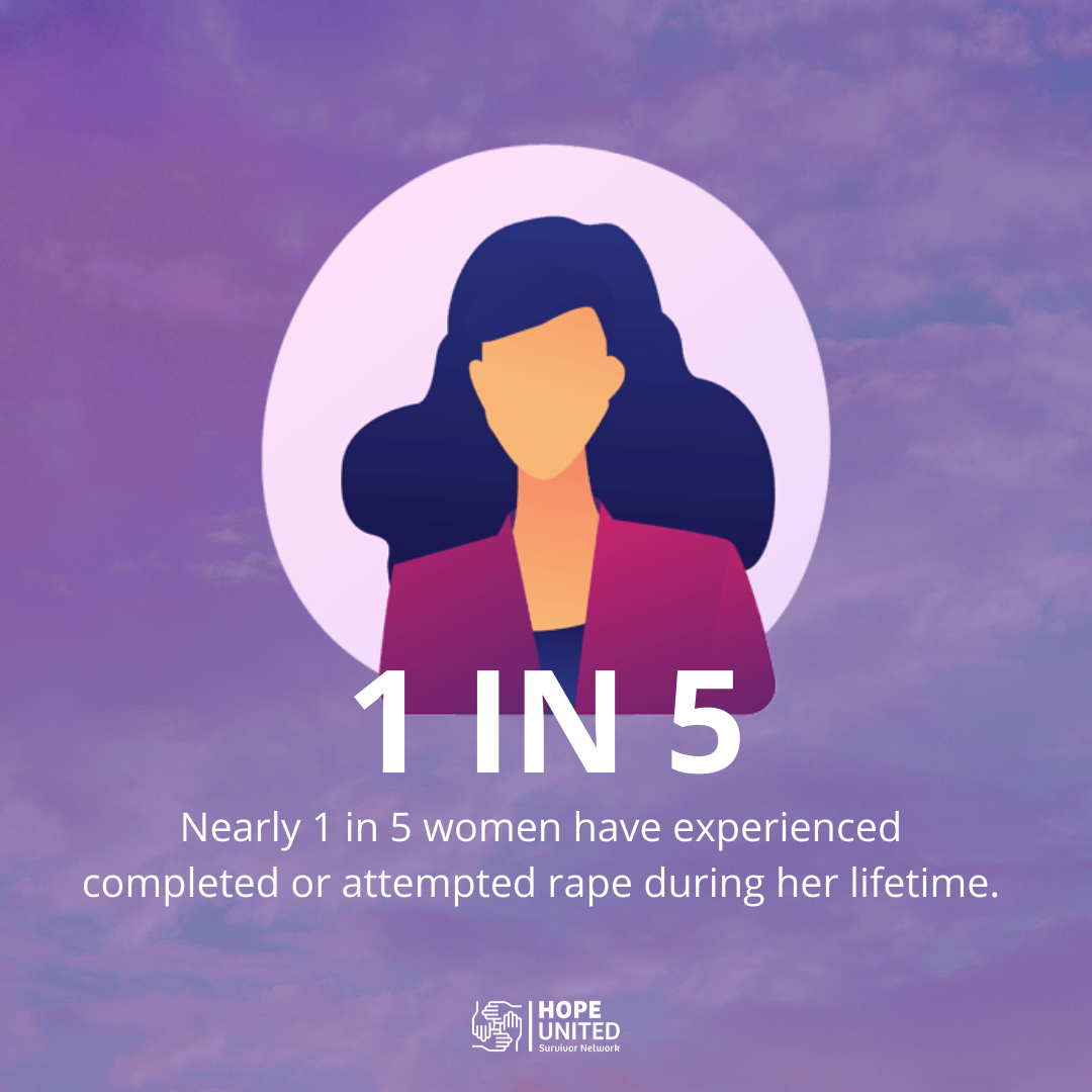
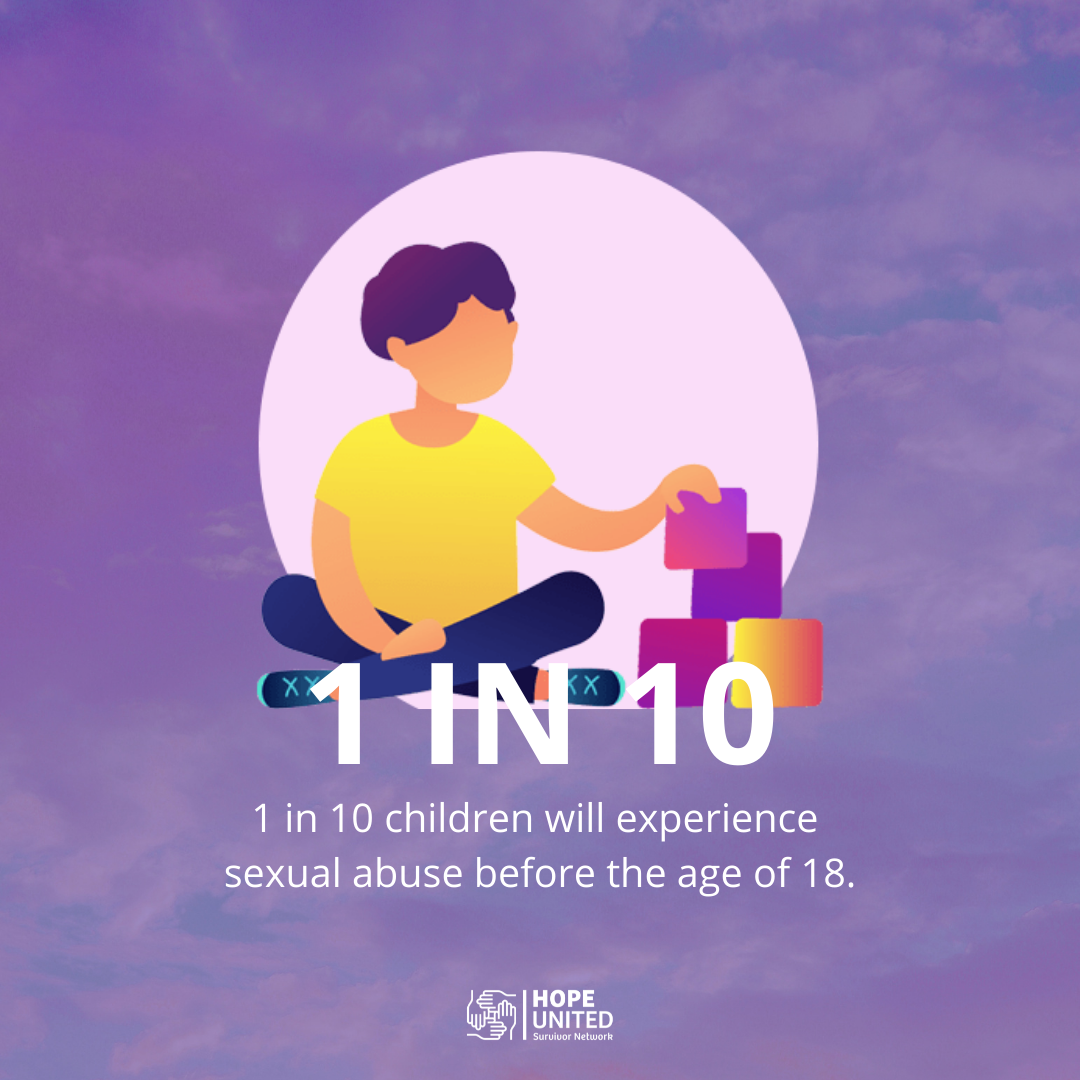
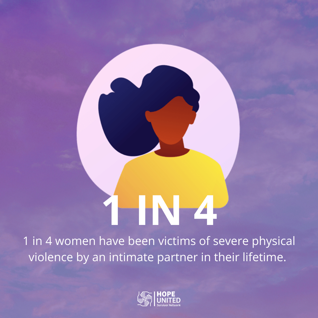
Hope United Survivor Network is a young community organization tasked with providing comprehensive survivor support services to victims of domestic violence, sexual assault, human trafficking, childhood sexual abuse and elder abuse.
Having recently merged three separate survivor programs into one umbrella organization, Hope United needed to unite multiple brands to create a cohesive brand identity and a unified way to market the programs. We worked with Hope United to help find this new identity and build an online home for their new platform as a county-level public service.
Services
[develop + design]
- Graphic Design
- Brand Identity Development
- Website Design
- Campaign Strategy
- Video Production
[deploy]
- CRM Implementation
- Campaign Execution
- Social Media Execution
- Email Marketing
Solution
Given that Hope United was combining three distinct programs with existing identities and needs into one new brand, it was important to lean on the develop phase of our process to ensure we allowed each program to shine as part of one new brand platform.
As with any project, we began by learning from key stakeholders and gathering information on the defining features of each program’s existing identity before we launched into the design phase.
We started by gathering input from key stakeholders in all three organizations through one-on-one interviews and an online survey.
Our team took the information gathered and set out to create a brand identity that honored the three programs while creating a singular brand platform. We crafted core messaging, a cohesive color story and a design style guide that connected the three programs under one umbrella.
Once these elements were established, our design team created logos for each of the existing identities and a responsive website that provided a home for their new brand.
In the deploy phase, we built marketing automation tools into their website to save their team time on marketing and reporting.

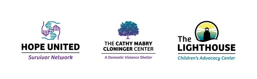
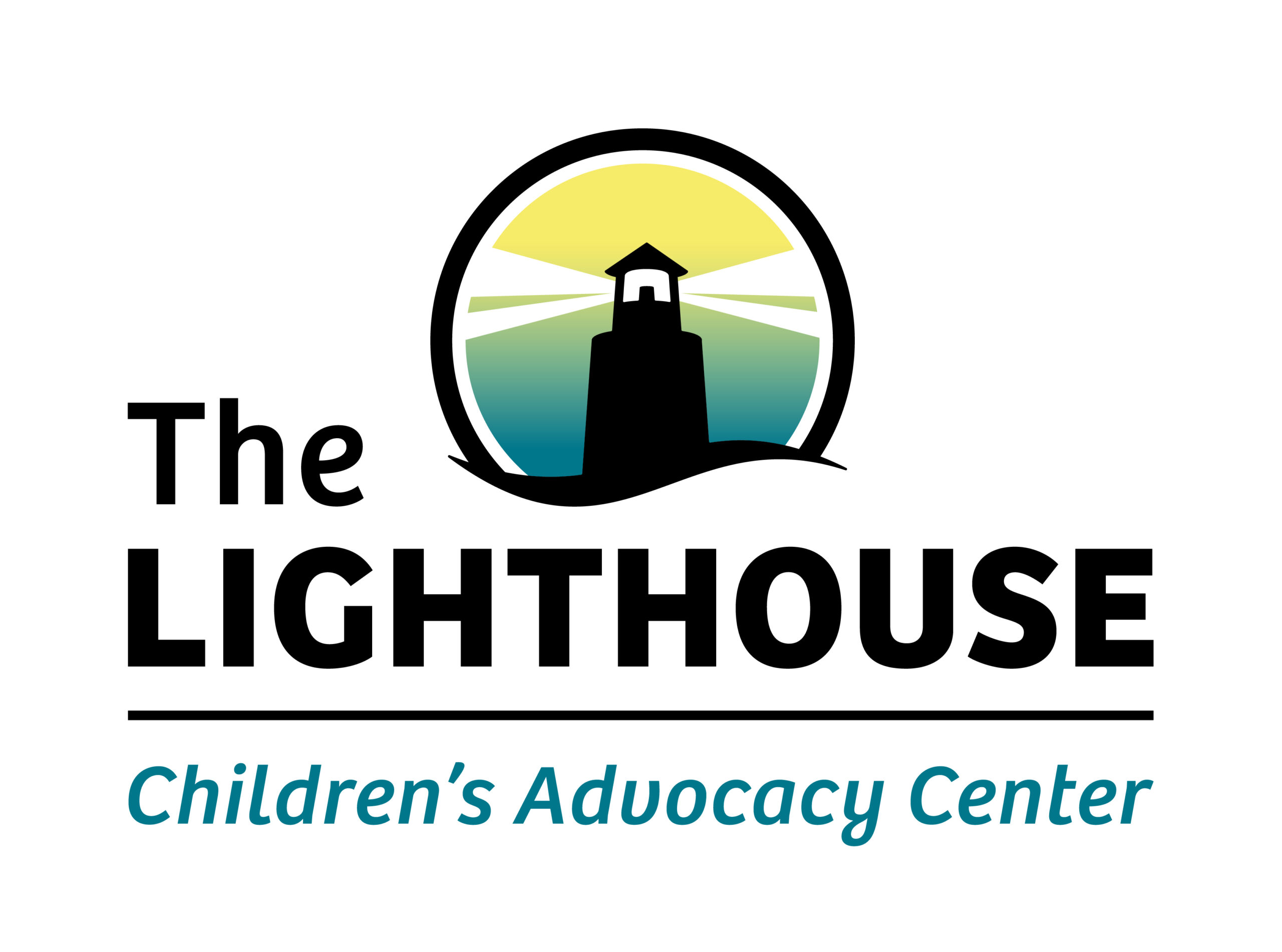
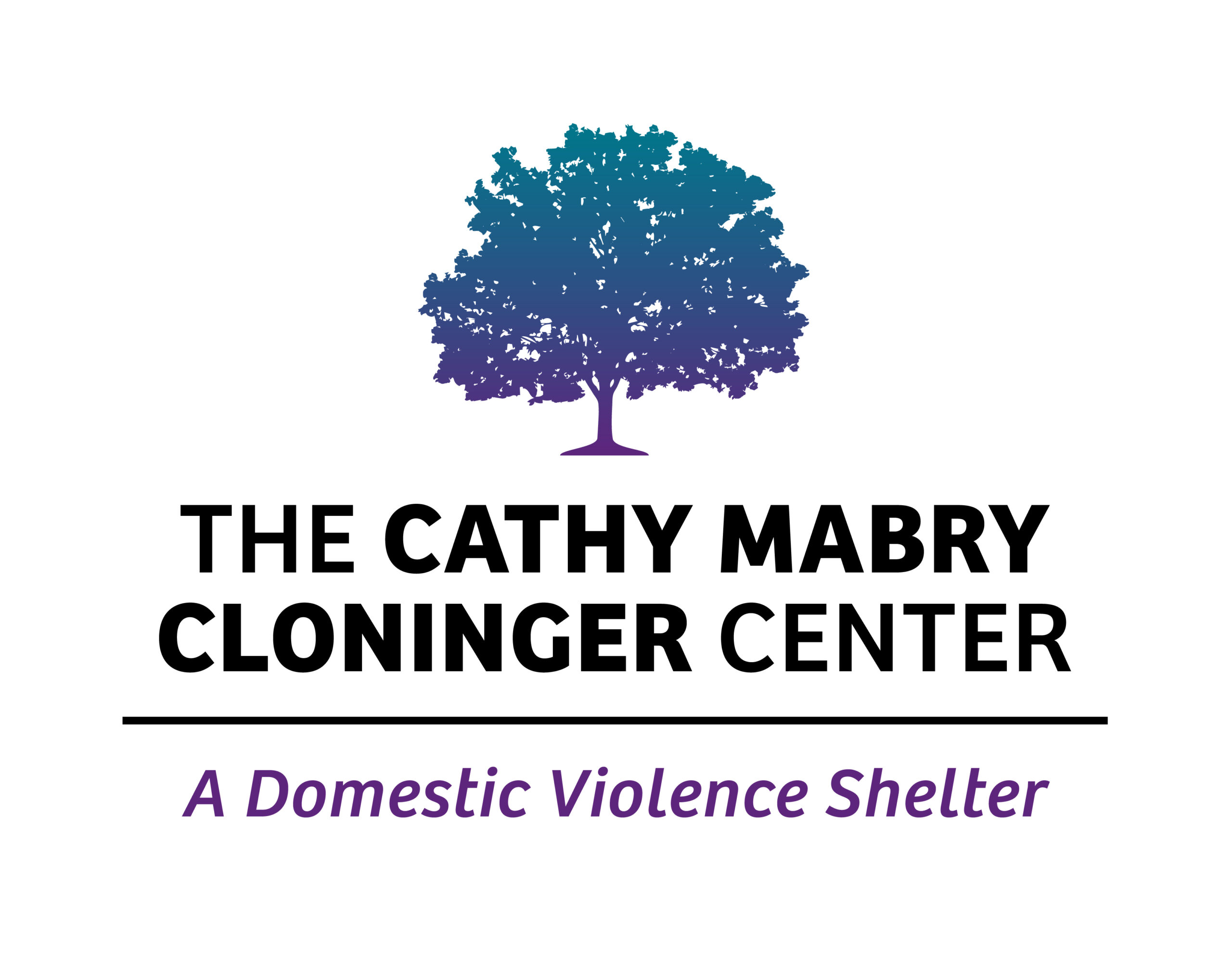
[the logo]
Each of the sister logos represents their core service offering and fits neatly into the single brand platform of Hope United while still paying homage to the previous identities. You’ll notice that the logos share structure and supporting elements to tie each one to the others.
[the colors]
Survivor Purple and Hopeful Teal serve as the main color palette for the entire brand identity. These colors represent the safety and healing the program provides to survivors. The Lighthouse logo utilizes teal and a golden yellow to symbolize the light it provides to survivors. The Cathy Mabry Cloninger Center plays off the teal and purple colors to tie directly into the Hope United brand.
[the fonts]
Each logo shares the same font to symbolize the unity between the three programs under their new brand identity. The font choice of Open Sans was made to allow for clear, accessible print in nearly any format.
“Quote Pending”
Source
Title, Association
Results
This new identity gives Hope United Survivor Network a platform to grow its programs well into the future.
The unified branding and marketing database will allow the organizations within the network to share contacts, resources and extend the reach of their respective programs.
Their new website, hopeunitedgaston.com, launched in Fall 2021. It provides information, resources and hope to survivors in need of support throughout Gaston County.
3
Previous Brand Identities
1
New Brand Platform
800
website visits since launch